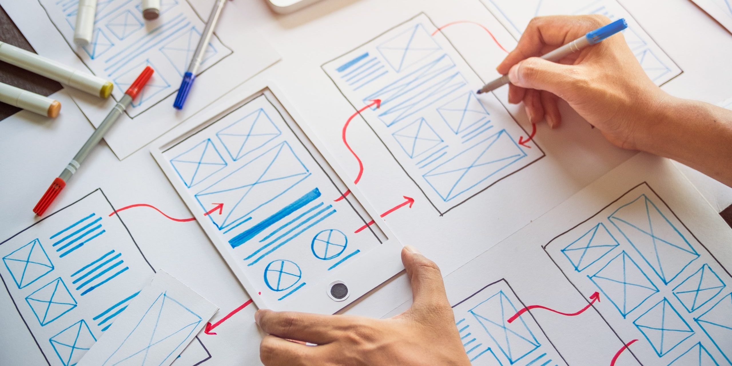
What is a Modal Ui?
A modal, which is sometimes referred to as an overlay, pop-over, pop-up, or dialogue window, doesn’t always take up the entire screen. It can show up as a slide-in or a pop-up when a page element is clicked on or hovered over, depending on how you set it. Ui Modal design is a useful tool in the user interface that, when used wisely, may help you attract users’ attention and keep them interested.

Modal best practices for better UI design

Explanatory Graphics:
Modals are infamous for being brief. Use images to convey what you can’t communicate with words.

Call to action:
The fundamental goal of a Ui modal design is to get your user to take a specific action. Give them a clear call to action to make their work easier.

Implement action-triggered modals:
For a better Ui design, ensure that your modals are pertinent to the user’s actions and stage of the customer journey. To put it another way, favor user-initiated modals.

Clear titles:
Make certain that your title is direct and short. To start, make sure the title of your modal explicitly states its purpose.

Pay attention to Sizing and location:
It’s crucial not to engulf the user’s full screen with your modal. They have little room on the screen to click away and leave as a result, which makes them feel as though they are no longer progressing toward their objective.

Craft an escape hatch:
As a fundamental usability rule, provide your modal an obvious escape route, a return later, or a snooze option. By doing this, you can guarantee that your attention is on functionality and user experience while also preventing user annoyance.

Progress bars for modal tours:
Progress bars are absolutely necessary for completions, particularly if you’re using Ui modal design to execute a product tour for user onboarding.

Stay consistent with what people know:
Avoid reinventing the wheel by sticking to modal UI design trends and UI patterns that people are already accustomed to.
Follow us on LinkedIn for more such updates!

